Next up in my end-of-semester round-up posts is my Color Theory class with Cameron Wasson. First and foremost, Cameron is such a delightful and knowledgeable teacher! Her metaphors--which, for the record, she concocts in an improvisational manner--make learning fun, and her zest for art both classic and contemporary is truly inspiring. I have made a couple of previous postings about my work for this class: my first Design Project and my analogous split-complimentary color scheme portrait painting. Here are some of the other projects I created for this class, starting with the Optic Mix painting:
As you can see, I started with the blue bird on a branch photograph, which I then cropped. Next, I created a black & white Value Study of the image, followed by a Color Study. The idea behind an Optic Mix painting is that the colors are mixed in the viewer's eye as opposed to the artist mixing them on the palette. Therefore, the final image is a series of tiny dots created with a ruling pen. It was a mind-bending experience, for sure, and I was never pleased with my control over the tool or the limited palette we were allowed. Next unposted project was a Color Temperature painting:
Here, Cameron gave us a box of colored blocks from which to pick and create an interesting arrangement. We then photographed that arrangement under a filtered light, in this case a warm filter. After the standard value and color studies, a final painting was created. The yellow block is all but lost in this painting, and the shadows were far too blue. Since this was a "learning" class--as opposed to a "create amazing portfolio artwork" class--I didn't choose to redo any projects. As long as I was learning from them, I felt they were as successful as they needed to be. And finally, we have the final project for the class:
The final project was a landscape illustration that showed Atmospheric Perspective. I went to my not-so-massive library of personal images and found some great ones from Lake Tahoe (from when my parents were kind enough to fly out here to San Francisco to visit me and free me--for the weekend--from this dreadful city). Following Cameron's advice to cater the image towards our Majors, I decided to use a cinematic aspect ratio, so I had to move around a few of the elements from the photograph before I created the usual value and color studies. You can also see a rare work-in-progress image just above the final painting. One thing I definitely learned from this final painting--besides how far I've come in my knowledge of painting with gouache paint and of color theory itself--is the importance of designing everything thoroughly in the early stages. Lack of design (as seen in the far-to-rough value study) lead to problems with the foreground plant life and ultimately really ruined what was otherwise a very pleasing painting. Lesson learned for next time!
Dec 25, 2010
Dec 17, 2010
Fall 2010 - Layout Design
Well, another semester has come to a close for the Academy of Art University, so that means it's time for my bi-annual (a word I'll use because "semesterly" apparently isn't one) posting of classwork. First up, Layout Design for Animators with Oliver Sin.
Posted below are the pages from my Final Book, which compiled all the weekly "Directions" that Oliver gave us to create a layout design for. I found this class to be a frustrating one--not artistically, but in terms of instruction--and I will definitely say that I'm not very pleased with any of the work I produced for this class. Not a complete waste of time and energy, but I definitely did not learn anything new about layout design. If nothing else, I will say that it's good to learn new techniques, even if those techniques aren't right for you.
Nov 8, 2010
Color Theory - Project 3
The third assignment for my Color Theory class was to pick a celebrity and create an analogous split complementary painting that tells their story with color. Easy, I know. After failed attempts at the likes of Megan Fox, Natalie Portman, and even Sarah Chalke, I finally came back to reality and chose Steven Spielberg. I found a fantastic picture of him in that famous director pose where they use their hands to frame a shot.
Then, I had to render that image, simplifying the shapes and assigning values that create form. Additionally, I had to think about the story I wanted to tell with my illustration. I also had to find another picture of Steven where I could actually see his left hand (since the right part of this image is blocked) and had to try to blend it into the scene.
You'll notice I also placed extra emphasis on the eyes to make sure that the focal point is clear. He sees the composition of his shot through his hands with his eyes. This was actually drawn roughly on paper first, then values were cleaned up and assigned in Photoshop, which made it much easier to play around with the values and colors of each shape.
Speaking of the colors of each shape, I decided to go with the Red Analogous Split Complementary color scheme, using the complementary Green around the eyes and splashed around the "Golden Rectangle" that his hands create. Cool colors for the hair and background, oranges for the face, and reds for the hands.
You can then see how all that work was for not, as my horrid painting abilities killed all my weeks of preparation (okay, so I can honestly say that it looks a bit better in reality than this scan shows, but it's still not so great). Gouache painting is not as fun as you may think...especially when you also have Layout Design and Preproduction work to get done, too. I think I'll be rather pleased when this semester is over...
Nov 7, 2010
Fuzzy Fury Rescue Friends: Back in Action
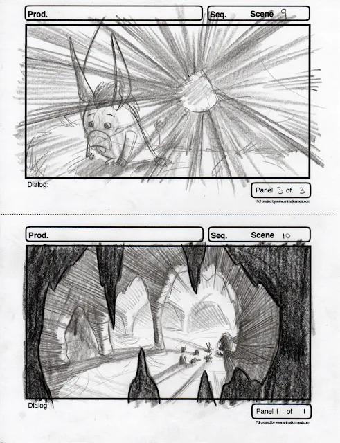
Now that I've finalized the content of my three thesis stories, I can start to focus on them one-by-one. First up: Fuzzy Fury Rescue Friends. This is my 3-D animated feature-length story, and I'm focusing on the climactic twist when we discover that the Unicorn was not actually kidnapped by the Dodo Bird, but was, in fact, constructing an elaborate plan to get the Dodo out of the picture so he could open up the portal to the Land of Imagination!!! Whoa! Below are some sketches of me continuing to figure out the character anatomy and then some presentation storyboards I did of an earlier story moment for this dramatic sequence.
[*all boards done traditionally with pencil on paper]
Nov 3, 2010
Shuttle Shorts
Good news everyone! My hiatus from Blog posting has not been without good reason: I've had to nail down my three story ideas for my Thesis Project. And that "good news" that I mentioned earlier? It's that I've finally nailed them down. :^) The next step is to really start fleshing things out, and I came to a realization that I haven't actually boarded anything in over a year! Yikes! So, I've decided to brush the dust off my Mad Skillz with some short little sequences based on things I find funny and/or have overheard on various Academy of Art Shuttle trips. Shuttle Shorts, they shall be called. Hopefully this will help sharpen my neglected story senses, because this first one is pretty rough...
*RUMBLE.*
Sorry. I'm trying not to throw myself all over you.
I'm going to pretend that's because you find me irresistible and not because of the laws of physics.
Subscribe to:
Comments (Atom)


