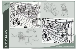
Well, another semester has come to a close for the Academy of Art University, so that means it's time for my bi-annual (a word I'll use because "semesterly" apparently isn't one) posting of classwork. First up, Layout Design for Animators with Oliver Sin.
Posted below are the pages from my Final Book, which compiled all the weekly "Directions" that Oliver gave us to create a layout design for. I found this class to be a frustrating one--not artistically, but in terms of instruction--and I will definitely say that I'm not very pleased with any of the work I produced for this class. Not a complete waste of time and energy, but I definitely did not learn anything new about layout design. If nothing else, I will say that it's good to learn new techniques, even if those techniques aren't right for you.


3 comments:
Oh man I'm right there with you. I both learned a lot and REALLY hated that class. I gave Sin the worst review ever.
I learned about the importance of putting crescent moons in the background so people know it's nighttime and that I'm caucasian. He mentioned them both at least once a class. Oh, and I learned that I don't want to do layout design.
Oh and don't forget you need some girl things if you are going to put a girl in it. Think tutus and high heels. Nothing even remotely boyish like tennis shoes.
Post a Comment